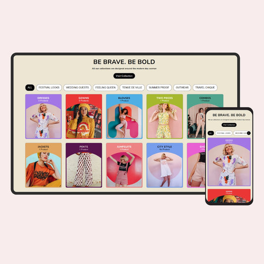
The Bento Grid layout is a modern design approach that allows you to arrange content in an organized yet visually appealing way, similar to a Japanese bento box.
This structure is widely used for dashboards, landing pages, and content-rich sections.
If you want to create a similar layout, you can use the example code provided below.
You have been provided with the necessary code to create a Bento Grid Layout for both desktop and mobile views. By using this code, you can easily structure your layout while ensuring consistency across different screen sizes.
Important Note:
The number of blocks you add in your code must match the number of blocks in the Bento Grid layout. If the count does not match, the layout will not work correctly.
By following this structure, you can efficiently create a responsive Bento Grid Layout for both desktop and mobile views.
The arrangement of blocks for the desktop and mobile version is as follows: