Setting up your homepage with Essential

Setting up your homepage with Essential

When you first install Essential, some homepage sections are already visible — namely the header and footer, which are standard for any online store.

Clicking on any of these section blocks will bring up a set of unique configuration settings. You can also click Add section, which will reveal an array of other optional sections that you can add to your homepage. 

At the very bottom of each section’s settings there is a Theme settings link, which you can expand to reveal additional settings that pertain to that section. Note that many of these theme settings affect elements beyond that specific section, so be careful with the changes you make here. These will be explored in depth in the article, Essential Theme Settings.

Blog posts

The Blog posts section allows you to display images and text from your three most recent posts. To specify the “preview” text that appears for each post, we suggest using Shopify’s excerpt function, which you’ll find in the post editor under Online store > Blog posts.

SETTINGS

If you want to give your section a heading, you can add it in the Heading field. Next, select the blog you want to feature from the blog setting.
You can also customize the details your blog posts display by checking Show date, show ‘view all’ button and/or Show post author.

Collection list

sections are designed to help you showcase new or seasonal collections on your homepage. With Essential you can feature up to twenty collections at a time.

SETTINGS

You can apply whatever heading you like to your collection list using the Heading field under Settings. Note that this is optional, and if you do not want to include a heading, you can leave the field blank and nothing will appear.

CONTENT

Here, you can select the collection(s) you want to display by clicking Add collection or one of the existing Collection blocks, then selecting the collection you want to feature from the  Collection list.You can set up collections in the Products > Collections section of your Shopify admin.

By default, Essential will pull either the collections image (set on the right side of the collections screen in your Shopify admin) or the first product. If you’d like to use an alternate image, you can click the Upload image button and select one from your computer (or library).

The featured collection section is designed to—you guessed it—draw attention to products from a specific collection on your homepage. You can display up to five products per row from the same collection in this dedicated space.

SETTINGS

Start by assigning a heading to the section in the Heading field. You can call it “Featured collection,” the name of the collection, or anything else you want!

Next, select the Collection you want to pull products from using the corresponding ‘select collection’ button. If you need to make changes to your collection, you can use the Edit collection shortcut on top of the field.

CALL TO ACTION

The call to action (CTA) is the “View all” tile that falls at the end of the collection row.

To change the text color, simply click the swatch next to Text color and select a different hue.

To add a background image (and replace the opaque colored background of the CTA), click the blue Upload image button or Select from library. We recommend a 500 x 750 px .jpg image, though keep in mind that whatever image you choose will be constrained to fit the CTA container.

If you want to change the background color of your CTA, it is tied to the theme style you’ve chosen (it matches the links throughout your theme). If you wish to change this, you can do so by expanding the Theme settings at the bottom of the section and changing the color swatch next to Links. Just know that the change you make here will affect not only the color of your Featured collection CTAs, but also all of your links!

Gallery

gallery is an amazing way to visually show off the best parts of your site and impress visitors. 

SETTINGS

The image sizes that show can be controlled by the Section height setting. This will crop the images to your choice of  Extra Small, Small, Medium, Large and Extra Large.

CONTENT

you can change image, image alignment, link and caption.

Image with text

SETTINGS

If you want to give your section a heading, you can add it in the Heading field.  It allow you to change image, image alignment, heading, text, button label and button link.

Image with text overlay

This sections are a lot like Image with text sections, only they come with a different layout: text overlay. They’re a great way to use immersive, high-res images, build your brand, and highlight special promotions and products.

SETTINGS

Begin by setting the Section height of your section ( SmallMediumLarge, Extra small and Extra Large).You can customize its position using the Image alignment setting.  This determines the point on your image that the section will center.  This setting has the most impact if your image has a different aspect ratio as the section. 

Then, you can add a  HeadingText and a Button.

An  Overlay is a semi-transparent filter that lies on top of your image to make the text easier to read. To customize the overlay, select a color using the Color picker and set the Opacity using the slider at the bottom (0% will make the image more visible; 100% will obscure it entirely).

Logo list

A great way of building social proof is by displaying the logos of your suppliers, collaborators, or even customers. If you’ve been lucky enough to have been featured in a reputed newspaper or magazine, use that. If you’ve worked with well-known bloggers, use that. Visitors to your store will associate your brand with the others shown.

SETTINGS

Start by assigning a heading to your section through the Heading field.  

CONTENT

To add a logo, click  Add logo or one of the existing Logo blocks. Select the Image you want to use (we recommend a 320 by 320px .png) and add the Link URL in the field below.

Newsletter

To help you build your mailing list, Essential comes with a customizable  Newsletter section. 

SETTINGS

You can give the section an optional Heading and Subheading

Slideshow

The Slideshow section is a great place to show off new items, offers, and sales in your store. It’s a static section. 

SETTINGS

To start off you can select to Enable slideshow and set the Autoplay slideshow options. You can set the duration of the slide with the slider below.

You can set section height in the settings under Section height setting.There you can set it to Small, Medium and Large.When setting the height, keep in mind that the Original aspect ratio will keep the image as uploaded but the other  will crop to fit the set size with a focus on the image’s centre.

The content on the Slide image is very flexible with customizable Text and Link.slideshow contain settings like image, image alignment, Heading, Sub-heading and slide link.

Instagram Feed

To integrate your Instagram account, you will need to locate and input your  Instagram Access Token. Follow the link (or click here) to learn how to generate a token. Copy and paste your token back into the Instagram access token field in the theme editor.

You can also customize the  Heading for your section here.

The Featured product section is designed to draw attention to a single product on your homepage.

SETTINGS

The setup for this section is fairly simple. Just select the product you’d like to feature using the Select product button. Other settings ars image size, Show quantity selector, Show Review, Show variant labels, Show vendor, Enable image zoom, show dynamic checkout button and show social sharing buttons.

Home Banner

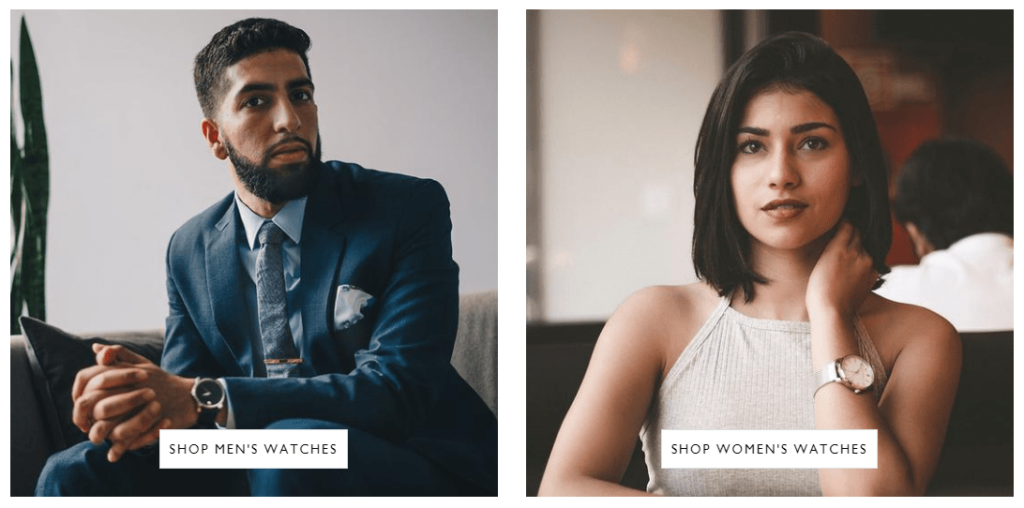
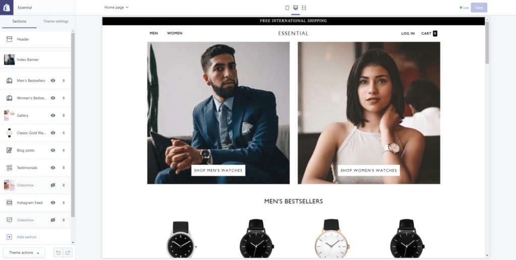
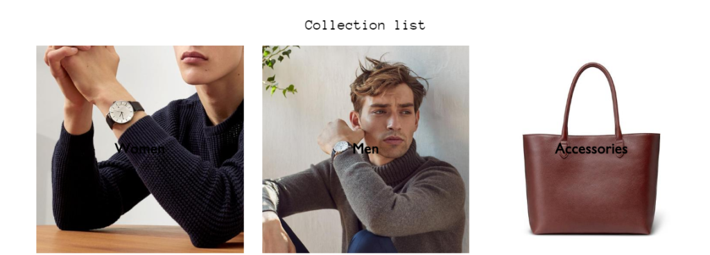
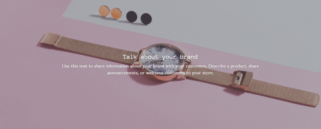
This section is a great place to show off new items collection. This section will appear beneath the Header section in your store.

SETTINGS

you can select banner image and add collection for this  banner image.you can also change button name using “Mens Button” settings.

Map

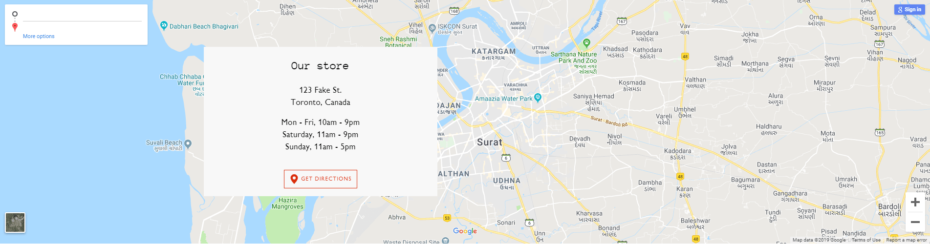
Essential comes with an eye-catching Map section that businesses with brick-and-mortar locations can use to display contact information and give directions to their store.

SETTINGS

Start by setting the Section height from the top dropdown. Then, add a Heading, then add text content (e.g. Hours & Location). Start by setting the Section heading then add text content (e.g. Address & Hours). Other settings for map address, map link label, iframe src, Image(Displayed if the map isn’t loaded), Image Position.
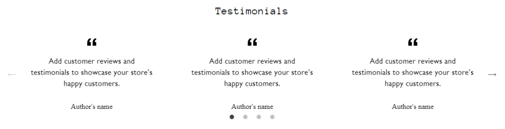
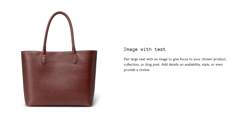
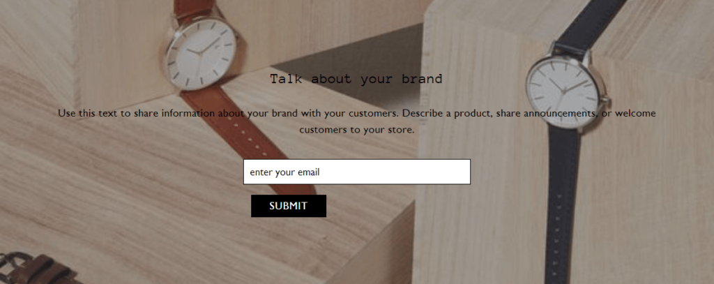
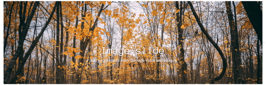
Rich text

The Rich Text section is a flexible feature to help add valuable content to your homepage. You can use up to two blocks within each Section. 

SETTINGS

Start by assigning a heading to your section through the Heading field.  You can choose between Regular or Wide  for the Section width to suit what you’re looking for. 

Testimonials

The testimonials section lets you display multiple blocks of text within a single section, with all the building blocks you need to show a quote and the Author’s name.

Custom content

In this section you can add content like Text, Image, Video, Product, Collection and Custom HTML.

SETTINGS

If you want to give your section  heading, you can add it in the Heading field. It allow to set time duration of slides changing and it give option to set auto-rotate slides in your section.