Essential header and footer
Fixed homepage sections
Fixed sections are components that are assigned to certain areas of your site and cannot be moved. In Essential, there are just two fixed homepage sections: the Header and the Footer (note that these sections appear on all pages, but we’ve put them here because they’ll probably be some of the first things you want to set up).
Header

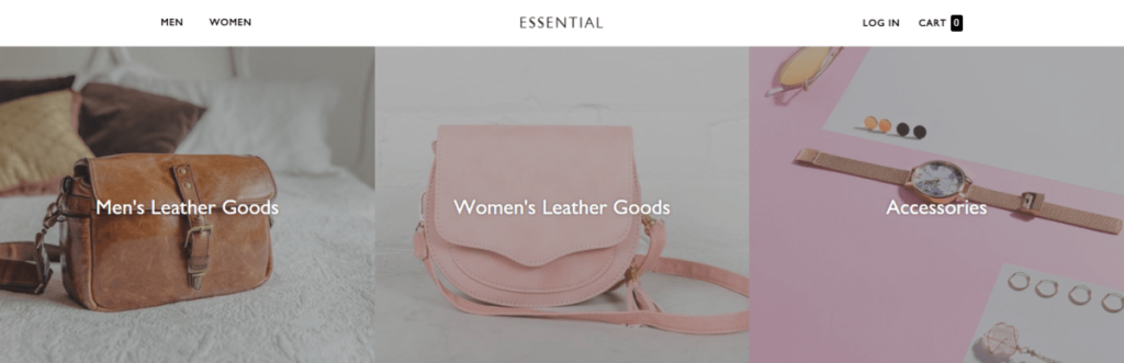
The header is the rectangular area that runs across the top of your store featuring your logo, navigation, login, and cart. It appears on every page and is intended to be used to promote your company’s brand and make it instantly recognizable to your visitors. This is a static section and cannot be repositioned.
Sticky header
A sticky header—also sometimes referred to as a fixed or persistent header—is a great option that “sticks” the header to the top of the screen, even as users scroll down a page. This can improve navigability, reinforce branding, and save time (nobody likes scrolling all the way back to the top when they realize they’re browsing the wrong page).
Essential sticky header compresses to preserve screen real estate, nesting navigational elements within a hamburger menu, and removing non-essential elements like the currency converter.
To use a sticky header in your store, simply check the Enable sticky header option at the top of the Header settings.
Logo
Your store’s logo provides branding for your site and a clickable link to return to the homepage.
By default, Essential will display your store name as your logo. To replace it, click the blue Select Image button and select the file you’d like to use. We recommend you use a 120 x 49px .png image file. Larger images will be automatically resized to fit this constraint.
Search
One of Essential distinguishing features is its robust enterprise-level site search. It features a live search (meaning it will suggest popular searches as users type), with options to include products, articles, and pages in the results. It also includes an optional “quick links” menu, which can direct customers—especially mobile customers—to products and content faster.
To enable search option , Under the theme Customize option search setting is available click on it and search Bar tab is open , select checkbox of “show search bar” . These allow you to:
- Show product images in live search results. When enabled, this will display icon-sized versions of images for products that come up in live search results.
- Show blog posts and pages in live search results. When enabled, this will include results from blog posts and pages in live search results. These results will display in a separate “Pages & Posts” column on the right side of your live search results.
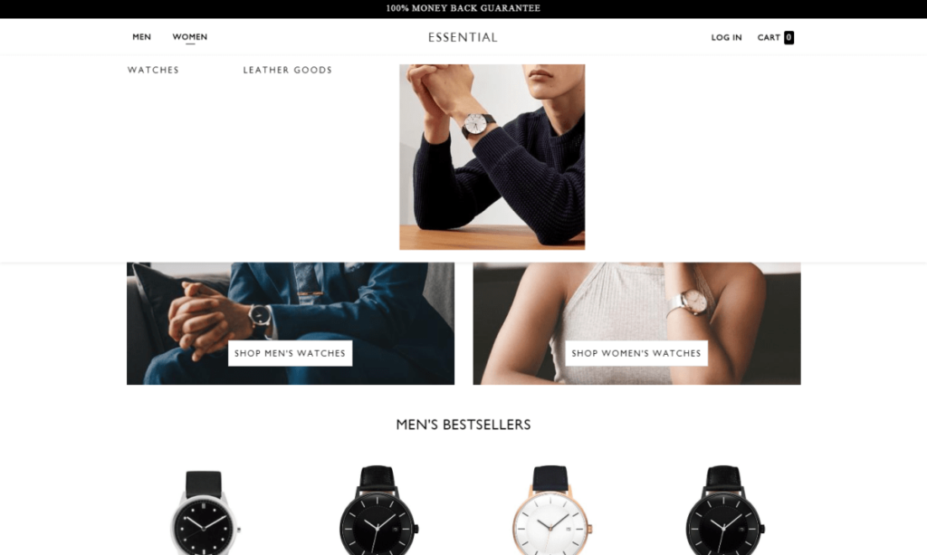
Navigation
To add links to your menus, you must leave the theme editor by clicking the back button in the top left hand corner (you actually need to click twice — once out of the Header settings and again on the Themes link to get back to the admin). Go to Online store > Navigation. There are two pre-populated menus here: Main menu and Footer menu. You can edit the links in these menus by clicking on the titles to edit them, or create additional menus by clicking the purple Add menu button.
With Shopify’s Nested Navigation control, you can add levels to the menus as needed. Once you have the nested menus added in the Navigation settings they become a basic nested menu in the Essential storefront. If you’re looking to enable a meganav, just head to Customize > Header, then scroll down to the Content section with Add meganav as an option. Once you click that you will just need to add the name of the menu item that you would like the mega nav to descend from.
Announcement bar

The Announcement bar is a great place to fill your customers in on new promotions, offers and changes to your store. This bar will appear above the Header section making in the first thing customers will see at the top of the page when they visit your store.
The Announcement bar settings include Color control for the text and background, the option to add a link and the text used. We even added a secondary text field to alter what’s shown on mobile screens. There are settings to easily turn the Announcement bar off and on, or limit it to displaying only on the homepage, as well.
Small promo
Mega menu images
Mega menus also have the ability to add images. You can add up to two images per Mega menu.
Here you can change the image size to Small, Medium or Large. You can also set the image placement to the first or last column. Text can be added below the image in addition to a link for the image as well!
Footer
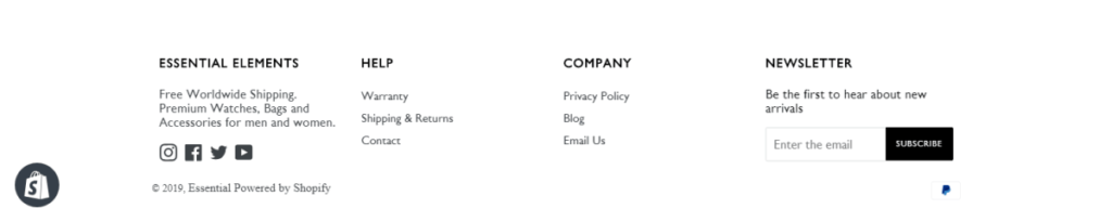
Like a footer on a document or report, a website footer contains information listed at the bottom of a page. Typically, the footer is the area where visitors expect to find the “fine print”—legal information such as terms and conditions and privacy policies and contact information.
Payment icons
Displaying the logos of the payment methods you accept is a great way of building social proof and clearly displaying your customers’ payment options. With Essential, you can easily switch these on and off in the theme editor by checking the Enable payment icons box under Footer > Payment icons.
Content
With Essential, you can add four optional types of content to your footer: Menu, Rich text, Social accounts, and Newsletter. You can add up to five content blocks here (in the example above, we’ve added two menus, one social media links, one rich text, and one newsletter). Just click Add content and choose the one you want to add. Setting up the blocks themselves is very intuitive—just follow the prompts!